Friday, April 2, 2010
FONT FLAG FRIDAY #8
(Click to enlarge.)
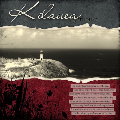
One of my favorite spots on Kauai...even on stormy days. In this case, shooting digital infrared (or NIF–"near infrared") enhanced the dramatic look, darkening the clouds and water and lightening the foliage.
Choosing two very different fonts, in this case Liana and Caslon Book BE, is one of the simplest and most effective design principles to remember when combining type faces in a single layout. Doing so supplies an element of contrast, and, simply put, our eyes like contrast. Strengthen that effect even more by contrasting type size and/or weight as well.
Here the use of Caslon was repeated in the quotation (by Henry Wadsworth Longfellow) for continuity and—importantly—readability in a smaller size.
(Thanks to Jessica Sprague, Trish Jones, Sweet Shoppe, and Jason Gaylor for additional Photoshop elements.)
Subscribe to:
Post Comments (Atom)


No comments:
Post a Comment