(Click to enlarge.)
This deluxe invitation is easier to lay out than it looks. In Photoshop, the opacity on the image layer is lowered, then layers of text are added. By putting text blocks and elements on separate layers, they can be edited and moved independently as you finesse the design.
Varying the size of the text within a layout creates visual interest. Enlarging the initials of the bride and groom adds contrast, an important element in graphic design. Invitations look best with lots of "white space" within and surrounding the text. Airiness adds elegance and prevents the piece from looking too busy.
The final image is printed on 8 1/2 x 11-inch photo paper, trimmed to a 6 1/4-inch square, then mounted on 90-pound hot-pressed watercolor paper (available at art supply stores). A sheer ribbon edged in gold holds additional components of the stationery ensemble in place behind the invitation, and a black linen envelope pulls the look together.
(Fonts: Shelley Allegro and Bank Gothic Light)
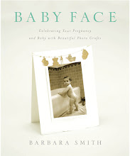
Find step-by-step instructions for this project and others in my book, The Art & Craft of Keepsake Photography: Engagements and Weddings, available in my website shop and through amazon.com and other online booksellers.
Wednesday, April 21, 2010
Monday, April 19, 2010
COMING SOON!
(Click to enlarge.)
Coming soon...digital graphic design kits! Transform your favorite photos into faux mixed media masterpieces to use as wall art, greeting cards, promotional materials, scrapbook pages, gifts, you name it.
Kits include textured backgrounds, frames and borders, Photoshop brushes, alphabets, and much much more.
(Any Photoshop CS version required.)
Wednesday, April 14, 2010
WEDDING WORLD WEDNESDAY: THANK-YOU NOTES
(Click to enlarge.)
A thank-you note is the perfect place for a favorite photograph from the wedding. The inside is usually blank or printed with a brief thank-you, affording sufficient space to accommodate a hand-written message.
Matching the three-pixel “stroke” of color around the image and the font color to the decorative paper lining the envelope creates a sense of unity.
If you're a professional photographer, don't forget to add your contact information to the back of the card...free advertising to a targeted audience!
Here's a fool-proof way to line an envelope:
MATERIALS:
- premade envelope
- decorative paper for the lining
- glue stick
- paper cutter and/or craft knife or scissors
- bone folder (for burnishing)
1. Cut the lining paper to 1/8 inch smaller than the envelope's outside width and equal to its height with the flap up.
2. Insert the lining into the envelope and trim around the flap.
3. Remove the lining and trim the bottom edge to the width of the glue strip on the flap of the envelope.
4. Insert the lining into the envelope, making sure to push it all the way in. Apply glue to the inside of the flap portion of the lining, then apply pressure to the glued area to adhere it to the envelope.
5. Fold the flap down and burnish the crease so that it lays flat.
Find this project and others in my book, The Art & Craft of Keepsake Photography: Engagements and Weddings, available in my website shop and through amazon.com and other online booksellers.
Monday, April 12, 2010
DON'T FORGET...MOTHER'S DAY IS MAY 9TH!
Check them out here in my shop. Whether you buy a kit (from $25-$40) and do it yourself or send me the picture and have me make it for you (from $75-$175), order now, before it's too late. For custom orders, the deadline is April 23rd.
Friday, April 9, 2010
FONT FLAG FRIDAY #9
(Click to enlarge.)
A 100% digital scrapbook page layout featuring photos of my darlin' granddaughters, Leila and Hana, along with some of my very favorite fonts.
I love how you can choose fonts that so vividly reflect the “mood” of the message you wish to convey. Here Texas Hero, One Fell Swoop*, and VT Portable Remington* unite to create a mood of casual elegance befitting a very special spring day.
*Free font alert!
(Thanks to Jessica Sprague, Jen Wilson, and Mary Ann Wise for all things scrapbooking.)
Wednesday, April 7, 2010
BABY FEAT
(Click to enlarge)
The design for this birth announcement came about quietly, simply, organically...just playing really.
Shoot...tear...fold...collect...combine.
Sunday, April 4, 2010
FLIGHT
Just sharing a couple new photos...I think this back staircase is the main reason I moved into my apartment, I even dream about it. I'm working on a series entitled "Flight."
Friday, April 2, 2010
FONT FLAG FRIDAY #8
(Click to enlarge.)
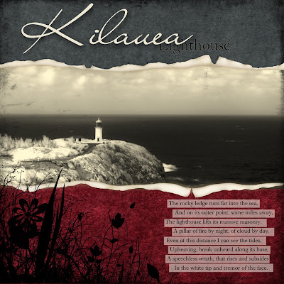
One of my favorite spots on Kauai...even on stormy days. In this case, shooting digital infrared (or NIF–"near infrared") enhanced the dramatic look, darkening the clouds and water and lightening the foliage.
Choosing two very different fonts, in this case Liana and Caslon Book BE, is one of the simplest and most effective design principles to remember when combining type faces in a single layout. Doing so supplies an element of contrast, and, simply put, our eyes like contrast. Strengthen that effect even more by contrasting type size and/or weight as well.
Here the use of Caslon was repeated in the quotation (by Henry Wadsworth Longfellow) for continuity and—importantly—readability in a smaller size.
(Thanks to Jessica Sprague, Trish Jones, Sweet Shoppe, and Jason Gaylor for additional Photoshop elements.)
Subscribe to:
Comments (Atom)


