Showing posts with label faux letterpress. Show all posts
Showing posts with label faux letterpress. Show all posts
Friday, February 19, 2010
FONT FLAG FRIDAY #2
Choosing fonts for a layout falls within the realm of graphic design, and although in the strictest sense there are lots of "rules," the choice of a font, or fonts, is actually somewhat personal and therefore hard to define. When you choose the right typeface, it just seems to "go" with the image and the emotion you wish to communicate. So just play with different faces until you hit one that makes you go "Yes!" Common sense prevails...if it's for the body of an invitation, you want a very readable font, but if it's for a banner or heading, you can go with something that conveys a strong feeling...romantic, grungy, scary, feminine, masculine, etc.
When combining two fonts in a single layout, it's most effective to choose two very different styles...often a script, calligraphic, or handwritten-type font along with a more classical font; a strong, bold font with a contrasting lightweight font; or one with serifs (those little curly-cues or lines you see at the ends of letter forms) alongside one without (ergo, sans serifs), in opposing weights.
Here I've chosen Letterpress Text and P22 Cezanne. I like Letterpress because it has an organic quality but is still highly readable. With its subtle level of decay and opacity, it emulates the look of the letterpress printing process in which a raised surface is inked and pressed into a sheet of paper. It's especially effective when printed on a heavyweight textured digital paper, and you can even take it further by adding an embossed layer style in Photoshop. (For detailed instructions, see my January 13th post entitled "Personal Fave.") Order Letterpress here at myfonts.com.
I have to admit that although I use P22 Cezanne in my own marketing materials, I'm a little tired of seeing it everywhere, but you can order it here at my very favorite foundry, P22. And while you're there, check out their shop and sign up for whatever you can...they are a great resource for not only fonts but gifts, ideas, and inspiration. Other fonts with a similar flair to P22 Cezanne (available elsewhere) include AL Verdigris, Jane Austen, Emily Austin, Dear Sarah, Baker Script, Lamar Pen, Houston Pen, and Jefferson.
Labels:
Cezanne,
faux letterpress,
Font Flag Friday,
P22
Wednesday, January 13, 2010
PERSONAL FAVE
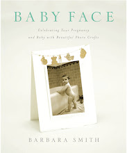
I thought I'd share my very favorite technique for making invitations and announcements. This is the only technique that appears in both of my books, in Keepsake Photography as a wedding invitation and in Baby Face as a birth announcement (featuring a photo, shown here, taken by Jimmi Johnson).
Letterpress printing, a technique in which a raised surface is inked and pressed into a sheet of paper, is labor intensive and requires not only a letterpress but a high degree of skill and craftsmanship. But by combining the right fonts with a heavyweight textured digital paper, you can create a faux letterpress effect with similar appeal. In both examples I used Arches Infinity Textured paper (355 gsm) and Letterpress and P22 Cezanne fonts. Although the Arches Infinity line has been discontinued, it can still be found; a comparable substitute is Museo II (365 gsm).
To add the letterpress texture, type the text as a Photoshop layer. Go to Layer>Layer Style> Bevel and Emboss. Select Emboss, choose 'down' as the direction (which creates "debossing"), and adjust the depth and other settings until it looks good to you. I like to keep it fairly subtle. Colors other than black look best because the shadows show up better...for instance, a nice dark brown. Aside from the Letterpress font, try Bank Gothic, Adobe Caslon Pro, Copperplate, Lithos Pro, Mrs. Eaves and Papyrus.
Subscribe to:
Posts (Atom)


