Wednesday, January 20, 2010


HAPPY BIRTHDAY, ERIN!
In honor of my daughter's birthday today, I thought I'd share a photo taken of me and my husband back in the day by our good friend Reed Fenton. Yep, we had lots of hair...as did Erin when she was born! I won't tell you the date, but let's just say it was long before Cindy Crawford and Demi Moore graced the covers of Vanity Fair!


GOOD FOR A LAUGH - ENJOY!
In one of my former lives I was a court reporter...mostly personal injury deposition work. When someone is involved in an accident, they're asked to describe what happened in as few words as possible on the insurance accident form. The following quotes were taken from these forms and were eventually published in the Toronto Sun newspaper:
"The pedestrian hit me and went under my car."
"In my attempt to kill a fly, I drove into a telephone pole."
"I had been driving in my car for forty years when I fell asleep at the wheel and had an accident."
"I was sure the old fellow would never make it to the other side of the roadway when I struck him."
"The pedestrian had no idea which direction to go, so I ran over him."
"I saw the slow-moving, sad-faced old gentleman as he bounced off the hood of my car."
"The telephone pole was approaching fast and I was attempting to swerve out of its path when it struck my front end."
"The other car collided with mine without giving warning of its intentions."
"I was thrown from my car as it left the road. I was later found in a ditch by some stray cows."
"The guy was all over the road; I had to swerve a number of times before I hit him."
"Coming home, I drove into the wrong house and collided with a tree I don't have."
"I pulled away from the side of the road, glanced at my mother-in-law, and headed over the embankment."
And my favorite: "An invisible car came out of nowhere, struck my vehicle, and vanished."
I hate it when that happens!
Monday, January 18, 2010
PHOTO FOLIOS

Mine are Polaroid image transfers, but you can use Bonny Lhotka's alcohol gel transfer process, or just print your images on a nice toothy fine art digital paper like Somerset Velvet or Museo II...maybe tearing them against the edge of a ruler instead of cutting them to add the look of a deckled edge.
If you'd like detailed instructions for making the folio, say the word and I'll send them to you!
Friday, January 15, 2010
DESERT SYMMETRY
Just got back from the desert...went to Joshua Tree with good friends and fellow photogs Jeanne and Steve Gadol. Although I love the soft neutral tones of the desert palette and the stark landscape, I just couldn't seem to find "my shot." Then I remembered a lesson from my photographer teacher Bob Ware at Santa Monica College way back when...he had us choose a 10-foot square area, anywhere, and shoot an entire roll of film there, making each shot count. It forced us to really see, not just look, and to use concepts of composition and depth-of-field to each shot's best advantage.


Wednesday, January 13, 2010
PERSONAL FAVE

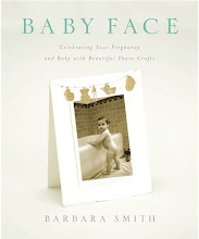
I thought I'd share my very favorite technique for making invitations and announcements. This is the only technique that appears in both of my books, in Keepsake Photography as a wedding invitation and in Baby Face as a birth announcement (featuring a photo, shown here, taken by Jimmi Johnson).
Letterpress printing, a technique in which a raised surface is inked and pressed into a sheet of paper, is labor intensive and requires not only a letterpress but a high degree of skill and craftsmanship. But by combining the right fonts with a heavyweight textured digital paper, you can create a faux letterpress effect with similar appeal. In both examples I used Arches Infinity Textured paper (355 gsm) and Letterpress and P22 Cezanne fonts. Although the Arches Infinity line has been discontinued, it can still be found; a comparable substitute is Museo II (365 gsm).

Monday, January 11, 2010
THOSE PESKY NEW YEAR'S RESOLUTIONS
- take a photo every day
- print it on something, anything
- apply mixed media (journaling, paint, encaustic, collage, etc.)
Okay...I could pretend I didn't see it, or forgot about it, I could even cross it out. But why not JUST DO IT, starting today. Maybe I'll be like Julie in "Julie & Julia"where she challenges herself to cook all the recipes in Julia Child's cookbook and documents it in her blog.
Instead of actually taking a photo, I decided to "take one" from my archives (hey, that's fair!), and this one caught my attention. I remember being inspired by the beauty of some vegetables I had just picked up from the farmer's market so I had placed them in my grandmother's old Bauer bowl, set them on a bench outside the back door, and snapped a few shots.
Here's the original...bor-ing, and not at all what I had in my mind's eye...no wonder it's been in hiding:
A few tweaks via Photoshop layer masks, then printed on wood...ah, now this is how I remember it, a dreamy summer's day, and a still life outside of time, outside of place:


This and more coming up in my video workshops...stay tuned!
Subscribe to:
Posts (Atom)