Wednesday, January 13, 2010
PERSONAL FAVE
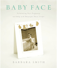
I thought I'd share my very favorite technique for making invitations and announcements. This is the only technique that appears in both of my books, in Keepsake Photography as a wedding invitation and in Baby Face as a birth announcement (featuring a photo, shown here, taken by Jimmi Johnson).
Letterpress printing, a technique in which a raised surface is inked and pressed into a sheet of paper, is labor intensive and requires not only a letterpress but a high degree of skill and craftsmanship. But by combining the right fonts with a heavyweight textured digital paper, you can create a faux letterpress effect with similar appeal. In both examples I used Arches Infinity Textured paper (355 gsm) and Letterpress and P22 Cezanne fonts. Although the Arches Infinity line has been discontinued, it can still be found; a comparable substitute is Museo II (365 gsm).
To add the letterpress texture, type the text as a Photoshop layer. Go to Layer>Layer Style> Bevel and Emboss. Select Emboss, choose 'down' as the direction (which creates "debossing"), and adjust the depth and other settings until it looks good to you. I like to keep it fairly subtle. Colors other than black look best because the shadows show up better...for instance, a nice dark brown. Aside from the Letterpress font, try Bank Gothic, Adobe Caslon Pro, Copperplate, Lithos Pro, Mrs. Eaves and Papyrus.
Subscribe to:
Post Comments (Atom)


No comments:
Post a Comment