Tuesday, February 24, 2015

DOODLING

I know. I have strayed far afield from photography…haven't taken a shot in quite a while. Yet I'm feeling myself being pulled back. Not sure how yet, but something's coming. 

In the meantime, my latest obsession, white ink on black background…really love the imperfect hand drawn quality. FYI, I learned this technique from Lindsey at my other latest obsession, The Postman's Knock. Her blog is filled with wonderful DIY tutorials and helpful hints... mostly about calligraphy but lots of other neat stuff, too. Check it out! www.thepostmansknock.com.

Wednesday, October 8, 2014

MAKE ART IN L.A.


In case you've been wondering where I've been, over the past year I've been hosting live workshops in L.A. at Make Art in L.A. 

It's all very exciting and growing day by day!

Please sign up for our newsletter and "like" our Facebook page to get the latest updates.

Check it out, spread the word, and join us!

I should also mention that I got married and my name is now Barbara Buckles...but most people out here in the blogosphere know me from B Smith Photography so I don't want to change that name. It's confusing, but I honestly don't know what to do about it.

Okay. Click here now: Make Art in L.A.

Thursday, November 14, 2013

THE MIXED MEDIA ARTIST

I can't remember when I first discovered Seth Apter online but once I did, a big part of my creative life changed. Not only did I order, use, and love his great how-to videos, through his blog I "met" a roster of amazing mixed media artists that continue to rock my world.

If you, like me, walk into an art supply store and feel like a kid in a candy store, you should check out his blog, The Altered Page, for non-stop inspiration. You may never look back.

Yesterday I received my copy of Seth's latest book, "The Mixed Media Artist: Art Tips, Tricks, Secrets and Dreams from Over 40 Amazing Artists." Oh-em-gee.

Get it!

Sunday, October 13, 2013

THEATER OR THEATRE?

Never mind the spelling, darling...I'm getting ready for "Nights of Soul" at the Sherry Theater in North Hollywood's NoHo Arts District where I'll have a selection of my photo art on display. I chose six images from my "Flight" series...I think the sense of theatricality suits the occasion to a T.

The tiny and intimate Sherry Theater is home to a creative community that houses not only plays but film festivals and, thanks to producer Ciera Parrack, ongoing variety nights featuring talented singers, musicians, dancers, poets, and visual artists.

For my part, I printed two 12" x 18" prints which I matted and framed, and also created four 5" x 7" photo encaustic pieces. Even though I originally made these images almost five years ago, I never felt I gave them their proper due in terms of exposure so it will be interesting to see how they're received.

My granddaughters, Leila and Hana, were my models for the image shown above...they were cute little girls then and are beautiful young ladies now...and they'll be performing a duet at the early (7 p.m.) shows! It promises to be a wonderful event...please join us and be entertained and inspired!

Here's a link to learn more and to buy tickets:

TWO NIGHTS: October 17 and October 24
FOUR SHOWS: 7 p.m. and 9:30 p.m.

Hope to see you there!


Tuesday, October 1, 2013

IT'S MY BIRTHDAY AND I'LL PLAY IF I WANT TO!


I love Love LOVE taking a straightforward photograph and then having my way with it! Garth and I went to Balboa Park in San Diego this weekend and happened upon a bonsai tree exhibit. Have been obsessively transforming drab backgrounds into painterly landscapes more suitable for these amazing works of art. This beauty is less than two feet tall!

Here's the before:


Wednesday, August 14, 2013

SETH APTER

Whoo-hoo...Seth Apter, my very favorite mixed media artist instructor, is coming to town, and I think there may still be a couple seats available in his "Background Check" workshop hosted by Gilding the Lily here in Fullerton.

Here's a link for all the details:
http://gildingthelilyclasses.blogspot.com/2013/08/background-check-with-seth-apter.html

And here's a sample of something I did with one of my photos using techniques I learned from Seth. If you have ever wanted to play with acrylic paints but weren't sure where to start, this is the place! Hope to see you there!


Tuesday, May 14, 2013

TRAVEL ART


A good trip can trip yield at least a year's worth of art projects...photo albums, scrapbooks, journals, wall art, handmade gifts, calendars, notecards and so on. Having just returned from my first trip to London, I'm just getting starting.

First I chose 100 (or so) of my favorite photos culled from the 1,200 (or so) I shot and made a little slide show for my friends and family before the novelty of the trip wore off and they lost interest. I kept thinking of one agonizing slide show my aunt and uncle forced on us after their trip to the southwest back in the early 50s and tried my best to choose photos that were beautiful or interesting in themselves, not just "and then we went to..." Feel free to check it out: Across the Pond

Today, my jet lag subsiding somewhat, I finally unpacked and found all the ephemera I had collected and tucked away...ticket stubs, brochures, maps, receipts, menus, found objects, lists, etc. I don't have the inclination to make scrapbooks per se at this point in my life, but I did want to save this stuff in a creative sort of way. I love making books, so I decided to make an accordion book, or concertina, out of one of the London street maps and turned it into a repository. It took less than an hour to make and  couldn't have been easier. I'll display it on a shelf for a while, then wrap a ribbon around it and pop it into a drawer to be rediscovered and perused from time to time.

1. Open the map fully and smooth it out on a clean tabletop.

2. Turn up 1/2" or so along the bottom edge and crease firmly. You may glue this down if you wish.

3. Turn up this bottom edge again, this time about 2", with the previously turned-up edge on the inside.  Don't glue this time.

4. Rotate the map so that the top edge becomes the bottom edge and repeat steps 2 and 3.

5. Fold the map in half lengthwise so there are now "pockets" along the outside front and back lower edges.

6. Apply a little tape or glue to all four outer edges just from the top of the pocket down to the fore edge to close the pockets.

7. Fold the assembly in half and accordion fold into equal segments. If you want more (smaller) segments, you may have to refold turning a "valley" fold into a "mountain" fold to get the proper accordion effect.

Now just slip ephemera into the pockets. You might want to add a date to the front of the pocket or a  decoration of some sort. Display open on a table top, or wrap with ribbon.


Saturday, February 16, 2013

What's in a Label?

Even though I've taught workshops and written how-to books, I feel funny calling myself a teacher. And even though I make art every day, I feel funny calling myself an artist. And every day I learn something new, yet I feel funny calling myself a student.

Well, here on my blog I'm all three, and I'm here to share my experiences as such with anyone who may share my interests in photo fusion...combining photographs with mixed media.

So far this month I've been a student learning about paint and the world of color therein. Making this valentine for Garth gave me an excuse to experiment with layers of acrylic paints to create depth and texture. I stuck with a monochromatic color scheme. Alas, no photo was included...here, the focal point is a set of hearts made out of paper cut from an old thesaurus describing synonyms for "love." My next project will feature a photo, I promise.

My thanks to Seth Apter and The Land of Lost Luggage for guidance and inspiration!

Mixed media: acrylic paint, vintage paper, metallic marker, rub-on, rubber stamps, found object on watercolor paper


Monday, January 14, 2013

REINTRODUCING THE AURATONE!

Work in progress...mixed media collage. It's really exciting to discover new applications for one of my favorite processes. Here I'm combining an Auratone print and a soldered Auratone pendant with a textured background and some found objects.


Maybe you'd like to expand your repertoire to include something that makes your photos look like vintage images with the gleam of gold akin to Edward Curtis' Orotones (circa 1920). It's a simple process...in fact, here's a little video demonstration. (Kits are available in My Shop.)

Auratone Pendants
The process also lends itself well to other media...it's a unique way to add another layer to your  paintings or other art...just take a photograph of the piece and then transform it into Auratone jewelry or prints.

A miniature Amadea Bailey painting transformed  into an Auratone pendant.

Photographer Nicol Ragland used Auratones to create this assemblage.


Wednesday, January 9, 2013

THE TEXTURE OF LIFE

If you're not already using textures or overlays in your Photoshop workflow, you're missing out on some serious fun! There are LOTS of sites offering texture downloads, some free (one of my favorites is Kim Klassen's Cafe), and others you pay for (like Flourish, Totally Rad, and Flypaper Textures), but for the most part I prefer to use my own. They're not difficult to make...in fact, my very favorites are simply scans of the end papers in old books I have on hand, or handwriting (real or font) on the back of a stained recipe card. And you can make them as subtle or bold as you want.

Here's the original photo...the process works best when you have an open background area like sky or a wall. (Picture this: I spotted this kid running up the dune, and his dad was chasing behind him. There I went, running interference thru the sand with camera in hand, trying to get the shot without the dad in it. Ah, the lengths we go to!)


Here are some of my scans:


And here's the photo using the scans in just a couple variations.


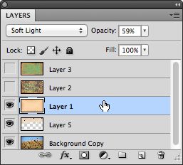
Here's the basic tutorial...some knowledge of Photoshop is essential:


1) Open an image.

2) Open a texture file, copy and paste or drag into original image. If necessary, drag handles to cover the image. (I often add multiple texture layers to one file, turning them on and off to judge the various effects.)

3) With the texture layer selected, go to Blending Mode and choose Multiply, Soft Light, or Overlay.

4) Adjust the layer Opacity as you like.

5) Use the Eraser tool (or a Layer Mask) to remove texture from any areas you want left alone.

For advanced exploration and seemingly endless variations,  adjust the color and/or saturation with Hue/Sat adjustment layer(s).

Let me know if you have any questions!

Wednesday, January 2, 2013

HERE'S TO AN ART-FILLED NEW YEAR!

I have but one New Year's resolution, and you can probably relate: make art every day. Of course there's always room for improvement in other areas, but that goes without saying. This one I have to say again (and you might want to repeat after me): MAKE ART EVERY DAY. Doesn't have to be a masterpiece, doesn't even have to be finished, just stay in a constant state of creativity on some level...be it taking a photo, journaling, trying out a new technique, even doodling...just keep the juices flowing.

In 2012 I made some 2013 tabletop calendars incorporating photos I'd taken during the year. It was a fun way to merge some favorite images, graphic design, and the book and paper art skills involved in making them by hand.

Each calendar measures 6" wide by 6 1/4" tall, and the pages rest on a little built-in easel made of sturdy 300 lb. watercolor paper. Front and back covers were printed on HahnemĂĽhle's William Turner textured matte fine art paper, and the monthly pages were printed on Epson Ultra Premium Presentation paper. The font is Mr. Moustache. The calendars were punched and bound using a (very affordable) Zutter punch. They fold flat and fit into a square envelope for wrapping or mailing.

Perfect for the holidays...this is a gift that keeps on giving throughout the year. And don't you think it beats a store-bought calendar...so much more personal! Why not start planning yours now?

My 2013 Calendar
February's Page

July's Page

Back Cover

This calendar is now available in MY SHOP...2014 calendars will be available in November 2013.


Monday, November 12, 2012

FOLLOWING THE DOTS

You're a unique amalgamation of everything you've grown to love over your lifetime.

Nothing is wasted! Following the dots, my own life as an artist began when I was a child who loved art and stationery supplies, blossomed when I took my first thoughtfully composed photograph and decided to make a greeting card out of it, and continues to flourish as, at 65, I combine one process with another to create something new each time.

Here's a case in point. 

From a simple photograph, to...


Some digital manipulation (in Photoshop or a smart phone app), to...


A handmade book, to...


A photo transfer to the book, adding a little encaustic to judge the effect, to...


Wall art...encaustic on birch panel.


I hope this inspires you! And if you're interested in exploring encaustic - basically, it's painting with hot beeswax - read about it and maybe even purchase an introductory CD or kit in MY SHOP

Saturday, November 10, 2012

SHE'S BAAAACK!

It's been so long since I posted I can't remember how...if I write here on my blog, I can't remember if it will also show up on my Photo Fusion Facebook page. Oh, well...only one way to find out. I apologize in advance if you see this twice.

Waxing rhapsodic! Have become enamored of and enraptured with encaustic (painting with hot beeswax). I will undoubtedly be incorporating photos at some point but am just playing with techniques for the time being. I love digital art, be it photography or graphic design, but it sure feels good to get my hands dirty for a change.


Tuesday, May 24, 2011

HIATUS?!?

Photo by Verofoto
Yes, I know...I said I was on hiatus to develop digital designs kits for you, and I really was...but I ended up falling in love and getting married, and now I'm packing and moving. As I'm often reminded, we make plans and God laughs. Anyway, I promise I WILL be back soon, in earnest, and with the promised kits, but in the meantime I just wanted to share some of the handmade highlights of my wedding.

Garth and I got married in a hardware store. Not just any hardware store...this is Liz's Antique Hardware in L.A., a one-of-a-kind astonishing and fabulous emporium of vintage hardware from all over the world, and upstairs is an art gallery (The Loft at Liz's) with an enormous vintage Murano glass chandelier hanging in a stairwell. In keeping with the hardware theme, we chose a metallic color scheme...gold, silver, bronze, and copper...which I integrated into my handmade items. Naturally, I made the save-the-date cards and invitations (actually, I collaborated with my very talented and creative husband). The invitation featured a metallic momi (Japanese paper) mobius strip a la M.C. Escher, signifying the endless nature of our love.


I decided to make whimsical trinkets to give to our guests as mementoes and used the Auratone process to make little charms with our initials and the date; another of the charms is an actual piece of hardware...a gold lamp ring. My personal trinket now hangs on the wall from a vintage hook...they can hang just about anywhere, or just sit on a table top, or dangle from a necklace, or adorn a picture frame. (Customized trinkets are now available in my shop...some events in life just demand a meaningful memento!)

I also made a guest book and covered it with one of my favorite decorative papers from Paper Source. Since this was a small, intimate wedding, each guest had a page on which to sign their name and write a note (if they so desired). Ultimately, wedding cards, photos, copies of our vows, and other memorabilia will be added to make this a mixed media album.
Lastly, I made a sleeve that housed a CD with a slide show and photo gallery and also served as a thank-you note. A CD-sleeve with a coordinating CD label is one of my favorite items to customize. If you'd like a set of templates so you can do the same, just let me know and I'll send it to you gratis, my wedding gift to you.

Friday, May 21, 2010

FONT FLAG FRIDAY #11

Do these two fonts work together? I'm not sure as a combo they fall within any graphic design guideline...each has such a strong personality they could fight with each other. My brain says "No, no, no!" but for some reason my eyes say "Yes!"

The idea of making font flags is to play with type combinations as you create your own reference library so that when the time comes to design a layout—an invitation, poster, business card, holiday greeting, whatever—you have them at your fingertips.

Let's imagine my imaginary museum group asks me to design a poster for an upcoming event and they need it yesterday. In almost no time at all, it's done. While this mock poster incorporates the font name of Bauhaus, I think the combination would work just as well for an invitation to a party or even a wedding. What do you think?

(Font Links: P22 Bauhaus, P22 DaVinci)

Wednesday, May 19, 2010

WEDDING WORLD WEDNESDAY: CANDLE FAVORS


Simplicity itself, and romantic and evocative when illuminated, candle favors are perfect for individual place settings but can also be grouped together to form an unusual centerpiece. Personalizing each candle with a beautiful photograph of the couple makes it a true keepsake.

Materials:
     - Matte photo paper
     - Scissors or paper cutter
     - Double-sided tape
     - Candle and glass cylinder
     - Ribbon, cord, or fiber (optional)

1. Create a page layout equal to the height and circumference of the glass cylinder, plus 1/4 inch for overlap. Incorporate a photo of the couple with their names and wedding date. (Font: Shelley Allegro)

2. Print, trim if necessary, and wrap the paper around the cylinder. Secure with double-sided tape.

3. Tie a length of ribbon, cord, or fiber around the cylinder if desired.

4. Insert candle.

Thanks to Gia and Pete Hettish!

Find this project and others in my book, The Art & Craft of Keepsake Photography: Engagements and Weddings, available in my website shop and through amazon.com and other online booksellers.


Monday, May 17, 2010

MONDAY MORNING MUSINGS - COMING SOON!


To quote Garth, the very special man in my life, "I'm in a constant state of photography." A weekend getaway yielded this image that I shot, transformed into a thank-you note printed on watercolor paper, and sent to the hotel manager, a personal friend who pulled out all the stops in treating us to a dreamy idyll.

The grounds were lush with exquisite gardens, and Garth spied an AMAZING ivy-type vine that I hadn't noticed; once he pointed it out, I knew it would make a wonderful border. Now I'm hoping I might be able to sell the cards in the hotel gift shop.

This is a preview of the types of kits I'll be offering for sale in the weeks ahead. Each kit will contain various Photoshop elements such as (shown here) a template for a folded thank-you note, a swirly vine brush, a vignette, and a mock embossed border...just add your own photo, print, and share. Of course detailed step-by-step instructions will also be included.

Stay tuned!

Wednesday, May 12, 2010

WEDDING WORLD WEDNESDAY: STOCK PHOTOS

Advertising agencies, Web designers, graphic designers, and lots of other entities frequently take advantage of stock photography – images that aren't taken for a specific client or purpose but are used and reused for multiple assignments.

For weddings, take some stock images of flowers, champagne glasses, couples' hands, rings, wedding cake brides and grooms, etc., that you can then use to create themed stationery ensembles: invitations, response cards, reception cards, and guest books.

Taking stock shots is fun; you have complete control and can get really creative, and you can also transform them into image transfers or manipulate them in Photoshop. I'm constantly repurposing my images. (Just between you and me, the old suitcase you see in the latest of the "Flight" series posted yesterday is something I shot about ten years ago; I knocked out the background and added it as a layer with a drop shadow.)

For baby-themed stationery – shower invitations, thank you notes, and photo albums – I took some stock shots of baby shoes ("painting" boy and girl versions in pink and blue in Photoshop), a teddy bear (again, "painting" a boy version with a blue ribbon around its neck, a girl version with pink), and a rubber ducky (unisex!).

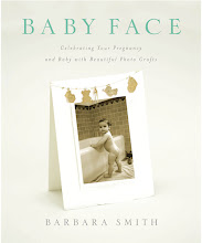
These projects and more are detailed in my books, "The Art and Craft of Keepsake Photography: Engagements & Weddings" and "Baby Face: Celebrating Your Pregnancy & Baby with Beautiful Photo Crafts," available in My Shop and at amazon.com and other online booksellers.

Friday, May 7, 2010

FONT FLAG FRIDAY #10


Contrast is the #1 consideration when combining font faces in a layout. Start with two VERY different fonts and/or type sizes. Here I combined P22 Typewriter and P22 Dearest.

P22 is hands down my favorite font house. Meticulously designed professional typefaces, often imitated  but never equaled. Sign up for their newsletter and/or become a Facebook fan to be among the first to hear about specials on existing fonts and introductions to new ones. And check out their shop…font-based apparel, glassware, publications, and other stuff…even a doormat!

Because I love you, here's a mini Photoshop tutorial for turning a photo into a sketch (as I did in this layout).  This works better with some photos than others, so play:

1. Open an image file and duplicate the background layer (Layer>Duplicate Layer>OK).

2. With the duplicate layer highlighted in the Layers palette, go to Image>Adjust>Desaturate, then go to Filter>Stylize>Find Edges.

3. In the Layers palette, change the blending mode for the duplicate layer from Normal to Overlay.

Voilá!

Wednesday, May 5, 2010

WEDDING WORLD WEDNESDAY: SELF PROMOTION


An "envelopment" wrapped in ribbon turns a simple flat card printed on a nice heavyweight stock into a gift.

I think word-of mouth is by far the most effective means of promotion, especially for a wedding photographer. Most people ask their friends for referrals before choosing an unknown entity from a directory or magazine.

So, after you've shot a wedding, here's a simple way to maintain the special connection you've cultivated with your clients so that they'll be sure to refer you, and it will even keep them coming back for more: As each anniversary approaches, send them a special card featuring a photo from their wedding and include a freebie or gift certificate for a discount on an anniversary photo session.

Next week I'll share another great tip for "guerilla marketing"... an inexpensive and very effective idea I bet you'll want to incorporate into your existing work flow.

Find step-by-step instructions for this project and others in my book, The Art & Craft of Keepsake Photography: Engagements and Weddings, available in my website shop and through amazon.com and other online booksellers.